What Makes Thomas Earnshaw Watches Stand Out in Design
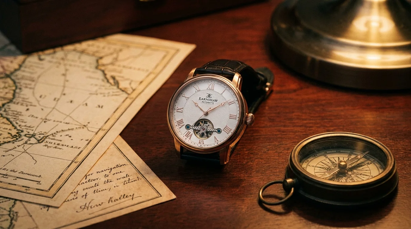
They don’t need to exert much effort to maintain their presence, as Thomas Earnshaw emphasizes. The name itself does much of the work in this regard. The original Thomas Earnshaw was an 18th-century British horologist whose marine chronometers helped the Royal Navy navigate the world. His instruments traveled on the HMS Beagle, the same ship that carried Darwin on his globe-circling voyage. That is not a manufactured backstory. It is actual history, and the modern brand named after him knows better than to waste it. What sets Thomas Earnshaw watches apart, though, is not just the story on the tag. It is how that story gets translated into every design decision on the dial, in the movement, and on the wrist.
The Heritage Behind What Thomas Earnshaw Watches Actually Look Like
The aesthetic of Thomas Earnshaw watches has a rich historical foundation beyond just “vintage vibes.” Earnshaw himself was awarded a portion of the Board of Longitude Prize in 1805 for his simplification of the spring detent escapement. This innovation made reliable marine timekeeping practical for ships that couldn’t afford a John Harrison-level instrument. His designs were stripped to the essentials, useful and exact. The modern brand keeps that same sensibility, then pushes it through a Victorian lens, and somehow it comes out looking intentional, not forced. Bold Roman numerals, onion-shaped crowns, layered dials, and Breguet-style hands. None of this is random old-world clutter thrown together “for effect.” Each element ties back to a specific slice of British clockmaking that Earnshaw himself would’ve lived with.
Signature Dial Design: Depth You Can Actually See
The dials are likely the first feature that catches people’s attention, and there’s a good reason for that. A lot of the models lean on a multi-layer approach, where the outer ring sits raised over the inner face. When light lands at an angle, that step forms obvious contrast and little shadow lines. That’s what gives you a kind of real, three-dimensional presence that flat-printed dials never really manage.
Some collections, especially the Longitude and Beagle lines, go even further with skeleton or semi-skeleton dials so you can see the movement doing its thing underneath. Some buyers call skeleton dials a gimmick, and honestly, they’re fair. Still, in this case it fits the philosophy. The brand emphasizes mechanical precision as a central theme, so displaying the mechanism is not merely for ornamental purposes. That’s the point. With skeletonized dial work, timekeeping turns into something you watch happen, not just something you glance at and move on from. You’ll also see Breguet-styled hands, moon phase indicators, and sun-and-moon-style complications across the range, adding nuance without making the dial feel stuffed.
The Exhibition Case Back: Confidence, or at Least a Reasonable Approximation of It
Brands that put their money where their mouth is and show you what’s inside basically invite comparison. The exhibition case backs on a bunch of these watches, including screwed casebacks on the Longitude series, reveal the automatic rotor and the movement architecture. Finish quality matters here, because the caseback is its own stage. This is not just a superficial window. The back of the watch is designed with equal care as the front, a level of craftsmanship that sets it apart from many other watches in the same price range.
Materials and Build: Where the Budget Goes
Case sizes tend to land somewhere between 37mm and 44mm depending on the collection, and stainless steel is the default material across the lineup. Finishes mix brushed and polished surfaces, so the cases look dressed up without drifting into “jewelry” territory. Genuine leather straps in brown, tan, and grey help reinforce that vintage British vibe, and they’re typically comfortable right from the first day, with no long break-in ritual needed.
Most models use mineral crystal, and there’s anti-reflection coating to help limit glare. It’s not sapphire, and buyers in this segment should go in knowing that. What’s more interesting is how practical the other details are: the grip feel of the onion crown, the action of the deployment clasps on bracelet variations, and how strap widths match the case proportions. These aren’t flashy, but they’re exactly the sort of things that decide whether the watch ends up on your wrist or stays in the drawer.
Movement Philosophy: Solid, Not Flashy
The brand uses Swiss and Japanese automatic movements depending on the model. In certain collections, chronographs rely on the Valjoux 7750, a 25-jewel automatic with a pretty well-established reputation in the industry. It brings a date window, tachymeter, and chronograph functions. Nothing rare or overly experimental, but also not something flimsy. The Westminster collection leans into Victorian industrial design vibes, with exposed flywheels and structural pillar elements, and it pairs them with automatic calibers meant for everyday use. That’s harder than it sounds. The look could easily make the movement feel like a prop, but it doesn’t.
Collections That Each Have a Reason to Exist
The lineup covers more ground than most people expect for a single brand at this price tier. The Beagle line points to Darwin’s voyage. The Longitude series borrows its name from the prize that effectively validated Earnshaw’s lifelong work. Kensington Heritage draws from London’s architectural character, with rectangular cases and open-heart dial layouts. These aren’t meant to be interchangeable variations. Case shapes, dial setups, and strap choices are different enough that each line keeps its own identity while still reading like it comes from the same place. Keeping that kind of consistency across a varied catalogue is tougher than it looks, and a lot of brands fail and end up with something that feels mismatched.
Value That Changes the Calculation
Skeleton dials, exhibition case backs, automatic movements, and genuine leather straps usually push prices way higher than what these watches ask. The brand handles design and distribution itself, which keeps costs lower and lets the savings travel to the buyer. For anyone who wants mechanical watchmaking paired with genuine historical context and a design that feels considered, the value argument is pretty direct. You’re not paying for a name printed on a dial. You’re paying for a watch whose aesthetic earns itself, not just one that claims it.
Why It Holds Up
Ultimately, what makes Thomas Earnshaw watches worth attention is not any single feature in isolation. It is that the history, the dial construction, the materials, the movements, and the collections all point in the same direction. Most watch brands at accessible price points either lean hard on heritage without delivering on design or deliver decent specs without any story worth telling. This one manages both, which is rarer than it should be.

You may also like
What Metals Are Best for a Diamond Band Ring and Why